 Anir Suren
Claude Design has to be the most underrated AI tool nobody's talking about. It's Anthropic's new creative tool that lets you build prototypes, mockups, presentations, and full brand systems directly inside Claude, by describing what you want. No Figma skills, no design background, and the output genuinely doesn't look like AI slop.
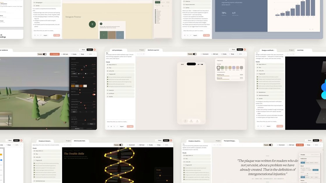
Real Claude Design output: apps, landing pages, decks, 3D scenes, documents.
How to use it, 30 seconds
- Go to claude.ai and click Design in the sidebar.
- Pick a template: prototypes, documents, presentations, even animations.
- Type anything you want to build and hit send. Claude designs the entire thing in seconds.
- When you're happy, hit Share up top. From there you can export it as a PDF, send it to Canva to keep editing, or hand it to Claude Code to actually build the working version.
That last option is the sleeper feature: design something visual, then one click sends it to Claude Code and it becomes a real, working product. Design to deployed, inside one tool.
The craziest use cases
1. One-shot app designs
Type "design a sleep tracking app with a dark, calm interface" and it produces full app screens that look like they came from a real product team. Ask for variations and it re-explores the whole direction: different colors, fonts, and layouts for the same idea. When one lands, send it to Claude Code and make it real.
2. Entire email marketing campaigns
Give it your product and your audience, ask for a campaign, and it designs the full sequence: the layout, the headers, the visual hierarchy, ready to export and load into your email tool. What used to be a designer plus a copywriter plus a week is now one prompt.
3. Brand kits that are crazy detailed
Ask for a complete brand kit for your business and it builds logo directions, color palettes with hex codes, type pairings, and usage examples, presented like a real brand book. Export the PDF and you have something you'd otherwise pay an agency four figures for.
4. Presentations that don't look like slides
Pick the presentation template, paste your rough notes, and it designs a full editorial-quality deck. Export to PDF for sending, or push it to Canva if you want to keep polishing by hand.
5. Instagram carousels that don't look AI-generated
This one's my favorite. Pick the Slides option, give it your topic, and paste this exact prompt with it. It tells Claude everything it needs to design carousels like a creative studio instead of a Canva template:
Create an Instagram carousel on the topic above, 1080x1350px (4:5 portrait), 8-10 slides. Follow every rule below exactly.

Design direction:
Design this like a carousel from a top creative studio, not a Canva template. Before building, pick ONE distinctive visual concept that fits the topic (editorial magazine, Swiss grid, brutalist, dark luxury, warm analog, technical blueprint) and commit to it on every slide. Never default to gradient backgrounds, stock icons, or the typical "creator carousel" look with rounded cards and pastel blobs.

Typography:
Max 2 typefaces: one expressive display font for headlines, one clean font for body. Headlines must be massive, readable from a thumbnail on a phone. Body text short and never small; if someone has to pinch-zoom, it failed. Dramatic size contrast between headline and body.

Layout:
One idea per slide. Max 15 words of body text per slide, split into more slides if needed. Generous negative space, at least 40% of each slide empty. Vary layouts across slides (full-bleed statements, oversized numbers, split layouts) but keep them clearly one family. Design for the swipe: each slide should end with a reason to swipe to the next, an open loop, a numbered step, or a cut-off tension line. Account for Instagram UI: keep critical text away from the bottom 150px and top 100px.

Color:
Strict palette: 1 background, 1 text color, 1 accent. Use the accent sparingly for emphasis only. High contrast, it has to stop a scroll in a feed full of noise. Pick an unexpected palette for the niche rather than the obvious one.

Content:
Write it yourself with real substance: specific numbers, sharp claims, concrete examples. No filler like "in today's world" or "unlock your potential."

Slide structure:
1. Hook slide: a bold claim, surprising stat, or contrarian statement. This is the cover; it must work as a standalone post. No "swipe for more" text, the design itself should demand the swipe.
2-8. Core content: one point per slide, numbered if it's a list format. Each slide must deliver standalone value AND pull toward the next.
9. Recap: the whole carousel compressed into one screenshot-able slide people will save.
10. CTA slide: one clear action (follow, comment a keyword, save). Keep it visually consistent, not a jarring "ad" slide.

Avoid at all costs:
Clip art, icons on every slide, drop shadows, decorative gradients, emoji in the design, dense paragraphs, identical repeating layouts, arrow stickers, "swipe" text on the cover, and anything resembling a default template.
Ask for multiple variations and it comes back with different colors, fonts, and styles for the same carousel. Pick the winner, ask for the download link, and it's on your computer ready to post.
How to get the most out of it
- Be specific about the vibe, not the layout. "Dark luxury, editorial, lots of negative space" beats "make it look good." It handles the layout; you set the taste.
- Ask for variations before you settle. The second or third direction is often the keeper, and variations are one sentence away.
- Chain it into Claude Code. Anything interactive you design (an app, a landing page, a tool) can go straight to Claude Code to become the real thing.
- Iterate in plain English. "Make the headline bigger, swap the accent to burnt orange, slide 4 is too crowded." It edits like a designer taking notes.
The honest part
It's a design tool, not a mind reader. The first output is usually 80% there, and the last 20% is you giving it direction like you would a designer. And for print-perfect work or heavy brand systems with existing guidelines, you'll still want a human pass. But for going from nothing to something genuinely good-looking in under a minute, nothing else inside a chat tool comes close right now.
Everyone's arguing about which model is smartest. Meanwhile Anthropic quietly shipped a full design studio inside Claude, and almost nobody's using it yet. That's the window.
Open Claude, hit Design, and build something random tonight just to see what comes out. That first "wait, it made THAT?" moment sells it better than I can.
– Anir
If this is the kind of AI thinking you want working on your own business, apply to work with me. And to catch the next breakdown, join the newsletter.